Real World HTML: A Funny Joining of Graphical Lines
In our last "Real World HTML" entry, we implemented the skeleton of the site (with a bit of heresy). Now we need to handle a small peculiarity of the design.
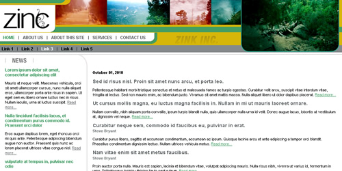
Before we go on, let's review our design in all three states.
Pre-Login State:
Post-Login State:
Subsection State:
Notice the curved line around "News". It curves around to the left wall, but when the user is logged in, the horizontal portion extends all the way in the other direction to the right wall as well. Additionally the horizontal line may appear without the curved line around the news section.
My general maxim is that "A thing should be as it appears to be.".
I decided to interpret this as two elements: The horizontal line and the curve line around the news. I made the curved line around the news extremely tall (2600 pixels) so that it work almost no matter how much content I put in. The JPEG image for this ended up being 10K - not too bad.
The other element was the horizontal bar. I used a 2X2 GIF (44 bytes) repeating horizontally for this. I did have to have an extra div for the horizontal bar, but overall not too bad.
background-image:url(i/main-top.gif);
background-position:top left;
background-repeat:repeat-x;
clear:left;
height:2px;
position:relative;
top:1px;
}
The relative positioning of 1 pixel from where it normally would have been allowed the horizontal line to sit in the same space as the top of the background images for the news. So, the effect is just what is desired. Minimal effort, minimal code and it is as it appears.
Next up boxes with rounded corners on top of a gradient (how I did solve it and how I should have solved it).


There are no comments for this entry.
[Add Comment]