Real World HTML: Client Review
In our last "Real World HTML" entry, we created a printable page - finishing up the implementation of the design and the print page. There's nothing left to do now, but show it to the client.
I don't think I have ever shown something to a client that hasn't wanted something changed - even if I show them a pixel-perfect match of the original design. In fact, I have been tempted to use the approach Hal Helms mentions for exacting clients (watch for the Rick Roll).
In any event, I had no reason to expect this to be any different.
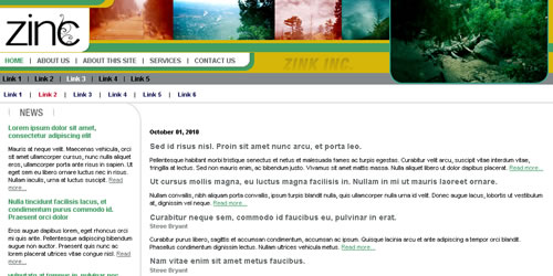
Just as a reminder, here is the design being implemented (one state of it, anyway):
So, when seeing my implementation, what did my client ask for? Three things:
- Center the design on the page
- Add a thin border around the site
- Add a little space above the design
These are actually aspects of the design implementation that could not have easily been shown in the comp, but rather interpretations of how the comp should be implemented on the page. It doesn't mean that the client changed their minds from the comp nor that I failed to implement it accurately. I mention this because it is tempting to think that any changes that come after implementation must be the result of one of those two things, but that isn't always the case.
In any event, these changes turned out to be easy.
I changed my CSS definition for my outer-most element from this:
margin:0 0 0 0;
padding:0 0 0 0;
width:1000px;
}
to this:
border:1px solid black;
margin:25px auto 10px auto;
padding:0 0 0 0;
width:1000px;
}
I was able to make those changes while on the phone with my client, which I always find fun and my clients seem to appreciate.
I'll not that I thought I might be requested to change the width of the site as well. If so, I could have changed the "width" definition above and everything else would have flowed correctly (even if it changed to "100%").
All in all a successful project!

There are no comments for this entry.
[Add Comment]