Real World HTML
HTML5 is currently all the rage. But while people are busy discussing the latest and greatest, maybe it is a good time and step back to look at how to write solid HTML4. Most of the HTML I see, frankly, could use a bit of work. I want durable HTML. Since I don't see that written about enough, I thought I would pick up the gauntlet.
First, I should define "Durable HTML". By this, I mean HTML code that can take a hit and withstand the unexpected. For example, what happens if a manually cleared float is added to the main content area of the page. Does it mess up the design? What about a wider-than-expected image or contiguous text string? What if the text is much longer than expected - making your site taller than you originally guessed? What if JavaScript is disabled?
How easy is it to make changes that - to the client - look really easy to make? What if they want to change out an image in the header? What if they want to change the width of the site or center it?
These are just some of the things that are easy to fail to anticipate when writing your HTML. Very often I see HTML that works, but only if everything continues to be as it was when the code was first written. When that code falls apart, it often does so in glaring ways. The key is to avoid obvious failure.
Rather than trying to speak in abstracts, I am going to take a real world example and work through it - using a site I actually did recently for a client (with different text, colors, and images). I will cover exactly what I did on this project for my client as well as things that I might have done differently if I had it to do over again (I usually have at least one of those for any given project).
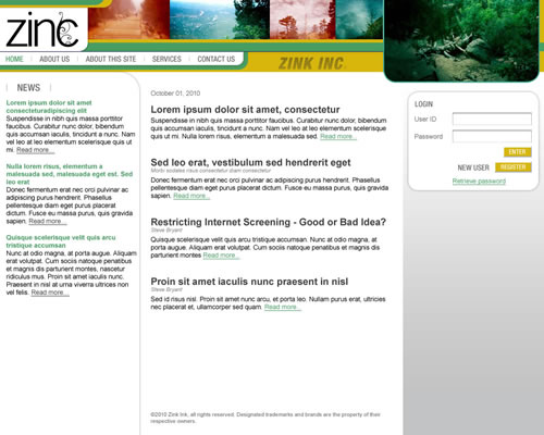
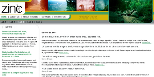
Here are images of the site I will be working through:
Pre-Login State:
Post-Login State:
Subsection State:
I won't be doing much of it during this entry, but will work through the whole design over the course of the next few entries. For now, look at the design and think about how you would code it. If you have time, maybe even jot down a little bit of what you think your HTML will look like.
Much of my HTML code structure is inspired by Transcending CSS: The Fine Art of Web Design - which I found on the recommendation by my friends and T.Moss Inc.
Skeleton Code
<head>
<title>Real World HTML: Example 1</title>
<meta http-equiv="Content-Type" content="text/html; charset=utf-8">
<link rel="stylesheet" type="text/css" href="/all.css">
<link rel="stylesheet" type="text/css" href="/print.css" media="print">
</head>
<body>
<div id="container">
<div id="header">
</div>
<div id="body">
</div>
</div>
</body>
</html>
Notice that the doctype is "4.0 Strict" The "strict" portion of the doctype will actually solve a good many IE issues as Internet Explorer has used that to indicate standard compliance in several versions (I believe as far back as 6.0). I manually defined the character set to utf-8. Usually this isn't necessary, but it is only a little bit of code and has saved me some trouble in the past, so it is a habit now.
The naming of the style sheets is just personal convention. I like to use "all.css" for my style sheet that is for all pages and all media. Then I name other style sheets based on purpose or page. So, I might have "index.css" if I have a style sheet that is specific to "index.cfm" or (as in this case) "print.css" that is for print media. I don't often try to break my style sheets into small purposes like "layout" and "forms", but I do sometimes have a "font.css" separate from "all.css" (and usually included from it) so that I can reference that in the user's wysiwyg editor. Again, this is just personal preference.
The HTML skeleton is pretty much out of "Transcending CSS". I'll cover more about this approach in upcoming entries as well detail attacking different aspects of this design.
I should really have named the "header" as "banner", but this is the code I used, so I will stick to that.
Here is the start of my CSS for all.css (print.css is empty for now):
YELLOW: #D9B60B
GREEN: #469E60
GRAY: #67686B
*/
/* UNIVERSAL DEFINITIONS */
body, p, td, li, a {
font-family:Arial;
font-size:11px;
}
body {
margin:0 0 0 0;
padding:0 0 0 0;
}
a {color:#469E60;}
h2 {line-height:14px;margin:0 0 4px 0;padding:0 0 0 0;}
h2 a {color:#67686B;font-size:14px;text-decoration:none;}
h3 {color:#87888B;font-size:11px;line-height:11px;font-weight:bold;margin:0;}
/* CONTAINER */
#container {
margin:0 0 0 0;
padding:0 0 0 0;
width:1000px;
}
The CSS isn't really very interesting yet, it is just a basic examination of the universal fonts in the design as well as the width of the design itself (I was sent a 1000 pixel wide PSD).
The one potential note of interest is that since CSS doesn't have variables, I just put a comment at the top of the file with colors that are being used throughout. I don't need to change them very often, but it is handy when I do. I just started doing this recently, but I like it so far.
The next entries will break down how I implemented this design and how it stands up to unexpected changes - some heresy is involved. I will end by covering what unexpected changes the client actually did throw my way and how I solved them.
Next up will be the site header/banner. So, take a look at that part of the design and start thinking about how you would implement it then come back next week and I will show you how I handled it.


Thanks. I'm pretty excited about it.
Phillip,
Does that mean I am too verbose? I would love to say that I will improve that in the next entries, but... we'll see. :-)
So it was meant to be kinda lighthearted, but also serious in making a note to self and the world that I needed to get back to it another time.
Well, I guess there's no time like 10:30 to go ahead and read it now!
Put everything that redefines tags in tags.css, classes in class.css, id's in id.css. Meh.
Then I thought about separating out everything that had to do with color into a color.css and
placing an if/then stmt in the header that if the user wanted to turn off color, they could. Meh.
I think I've got several standard css files. /Library/css/Table.border.css redefines a table with class="border" to have a 1 px border.
/Library/css/Label.css redefines the label tag as display:block.
Those are two pretty much universal .css files that I use.
So then my main.css does an @import of /Library/table.border.css and /Library/Label.css.
The /Library subfolder is common to every website.
I certainly like the idea of having a folder that is available to every site for universal client-side resources. In the specific case you have outlined, however, it sounds like you have separate files for each of several very small bits of CSS code.
Might snippets in your IDE be better for this?
I'm not overly worried about extra HTTP connections when they make sense (as will be clear in this series), but here you have an extra HTTP connection and extra include code in your CSS for each of several very small snippets of CSS.
For example, your Label.css file probably looks like this:
label {display:block}
For that you have to have this in your main CSS file:
@import url("/Library/Label.css");
Which is more code than the file itself and you still have the code in the file and an HTTP connection from the browser to download the file.
I may be missing some essential value, of course, but this seems like overkill to me.
I think having a separate file to include one line of code does cross over into diminishing returns.
In myobscurecssfile.css, which is included sneakily in some layout template (making it available to every page on the site), the author will write something like --
td { width: 100px; }
I'm all for universal CSS code, but one should be very cautious about its use. Any universal CSS should be extremely easy to locate (such as Steve has done at the top of his all.css file), and unless there is a compelling reason to do otherwise, we should never see universal CSS that affects (or could affect) layout HTML. If you MUST use universal CSS for handling some repeated piece of layout, at least use aggressive specificity to define it (e.g. body.subsection table#specialpurpose td.myspecialcell { width: 100px; }). Anyone who has ever wasted an hour (or more) of their life searching for such elusive universal code is smiling and nodding their head right now.
Be sure that your selector accurately describes what you what to effect. If you use an element as your selector, be sure you really want that styling applied to *every* instance of that element that could *ever* be used *anywhere* in the site.